Browse

Log in / Register
 Share

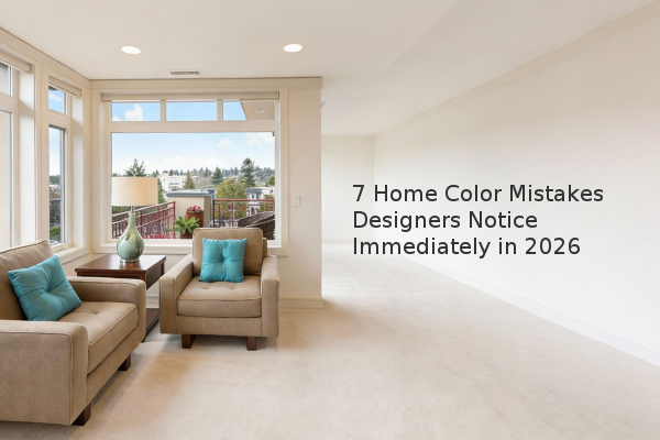
Choosing the wrong paint colors is one of the most common and costly mistakes homeowners make, often negatively impacting a home's aesthetic appeal and potential resale value. Based on our experience assessment, the most frequent errors involve poor timing, overly bold choices, and a misunderstanding of fundamental design principles. Rushing the painting process before selecting key furnishings and ignoring the importance of color value are particularly detrimental. This guide outlines the seven color decisions that professional designers consistently identify as missteps, providing actionable advice to help you avoid them and create a more harmonious living space.
Many homeowners, excited about a new space, make the mistake of painting first. Karen Gray-Plaisted of Design Solutions KGP emphasizes that painting should be the final step in a room's design process. The larger furnishing decisions—such as rugs, upholstery, and drapes—contain a complex mix of colors and patterns that should inform the wall color selection. Choosing a paint color in a vacuum, without these foundational elements, often results in a palette that feels disconnected and forced. By waiting, you ensure the wall color complements the room's entire aesthetic, creating a cohesive and intentional design.
While personal expression is important, certain bold colors can quickly date a space. Sara Chiarilli of Artful Conceptions specifically points to red walls as a trend that now makes a room look outdated. Furthermore, painting an entire room a very dark or ultra-bold color, like a bright red, can be overwhelming. Dessie Sliekers of Slick Designs suggests that bold colors work best as accents, such as on a single feature wall, where they can complement the space without dominating it. For rooms with a specific function, match the color to the vibe. Dee Schlotter, a senior color marketing manager at PPG, notes that blues can decrease appetite, making them a poor choice for dining areas, while Sara McLean of Dunn-Edwards recommends soft greens and blues for creating a serene, spa-like master bedroom atmosphere.
Exposed brick is a highly desirable feature for many homebuyers, adding texture and depth. Painting over it is a decision designers approach with caution. "I really struggle when I see this, because brick often lends so much texture and depth to a space, and it makes a great focal point," says Sliekers. While painting brick white can brighten a room, completely whitewashing it often results in a loss of character. Before covering brick with paint, consider that it is a permanent alteration that may detract from your home's value and architectural interest.
The accent wall, when used correctly, can add focus and dimension. However, overusing this technique is a common error. Chiarilli advises that you do not need an accent wall in every room, as too many can make a space feel choppy and smaller. She also warns against creating accent walls on opposite ends of a room, a look that only very large, open homes can successfully pull off. Additionally, Justin Riordan of Spade and Archer Design Agency highlights a technical flaw: never end an accent wall color on an outside corner. This makes the paint job look one-dimensional and unfinished. The color should always wrap around to an inside corner for a professional appearance.
A frequently overlooked aspect of color theory is 'value,' which refers to a color's lightness or darkness. Selecting different hues with the same value is a significant mistake, according to Chiarilli. Effective color pairing requires contrast in value. For example, if you have gray walls and want a green accent wall, the green must be noticeably lighter or darker than the gray. Without this contrast, the colors will blend together visually, creating a flat and uninteresting effect rather than the intended dynamic appeal.
Incorporating a rainbow of colors often leads to a chaotic and visually stressful environment. Riordan explains that the solution is to limit your palette to one primary color story and use neutral shades like brown, beige, and cream as the foundation. These quiet neutrals provide visual rest and allow any brighter accent colors to truly stand out. A restrained color palette creates a sense of calm and sophistication, ensuring the space feels curated rather than cluttered.
Understanding paint finishes (sheen) is crucial for a professional result. Chiarilli notes that shiny finishes like satin and semi-gloss are not ideal for walls, as they can highlight imperfections. For interior walls, eggshell or matte finishes are recommended because they provide a soft, low-reflectance look that hides flaws. Shiny coats, however, are perfect for trim, doors, and ceilings because they are more durable and easier to clean. Lastly, she advises against overusing the distressed furniture finish. One or two pieces can add character, but filling an entire space with this look appears dated and overdone.
To achieve a professional and timeless look, always finalize your furnishings before selecting a paint color. Use bold shades sparingly as accents rather than dominating a room. Preserve architectural features like brick whenever possible, and be strategic with accent walls. Always ensure contrast in color value for a dynamic effect, and limit your overall color palette to maintain harmony. Finally, select the correct paint finish for each surface to ensure a polished and durable result. Following these guidelines will help you create a home that feels both personal and professionally designed.