Browse

Log in / Register
 Share
Share
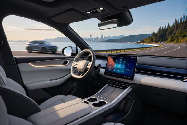
A new, cleaner media interface for the Android Auto dashboard has been uncovered in a recent version of the app, signaling Google's continued push to refine the in-car experience. The update, discovered through an APK teardown, focuses on decluttering the now-playing card that appears alongside navigation. May 24, 2024
The redesign represents a significant visual departure from the current layout. Instead of stretching album artwork to fill the entire card background, the new design places it in a centered, framed position. The colors from the artwork are then used to generate a subtle, blurred background layer. This shift creates a more hierarchical and less visually chaotic presentation, allowing critical information like the song title and artist name—now positioned below the artwork—to stand out more clearly.
Beyond aesthetics, the updated card has the potential to offer more direct control. Code suggests the layout can accommodate additional playback buttons, such as "like," "shuffle," and "repeat." The availability of these extra controls is not universal; it will be context-dependent. Factors like the specific music streaming app in use and, more crucially, the physical display of the car's head unit will determine if there is enough screen real estate to show them. On units that do support the expanded layout, the play/pause button is expected to shift to a more central position among the controls.
This update is specifically for the compact media card that lives on the multi-panel Android Auto dashboard. It does not affect the full-screen media player view, which users see when they explicitly open a music or podcast app. The change is part of the broader Android Auto revamp previewed by Google at its I/O 2026 developer conference, which also includes the gradual rollout of a new Immersive View for Google Maps featuring 3D buildings.
The discovery of this interface within the app's code is a strong indicator that Google is actively developing and testing this new look. APK teardowns parse unfinished, in-development code to reveal features that are being worked on but not yet active for the public. As such, while the design appears polished, Google could still modify or even scrap it before a wider release. However, its alignment with the stated design direction from I/O makes a future rollout likely.
This evolution of the dashboard media card highlights a key trend in in-car UI design: the move from maximalist information display to focused, glanceable clarity. By reducing visual noise and centralizing the primary visual element (the album art), Google seems to be prioritizing rapid driver comprehension. The conditional addition of extra buttons further reflects an adaptive design philosophy, tailoring the interface to the capabilities of different vehicle infotainment systems rather than enforcing a one-size-fits-all approach.